Scan the QR code below


The elimination of trading fees from apps like Robinhood, the proliferation of online investing and a widespread perception that supernormal returns can be made are leading to a flood of new investors in the stock market. In light of this, it is surprising that so many millennials are investing in stocks. Young people are often not as financially literate as older generations. Statistics show that only 24% of millennials demonstrate financial literacy and 34% of millennials are unsatisfied with their current financial situation.
I began my research by conducting qualitative interviews with different types of investors, majority of whom were millennials looking to invest. This helped me understand the perceptions new millennial investors had towards money and the challenges they faced.
Key insights surfaced from my research:
From these interviews and conversations, I created user personas and crafted a journey and empathy map.
I chose to focus on the core user needs that were uncovered:
New investors want an easy way to invest with a foreseeable financial future. They want to know whether its possible to achieve certain goals like buying a house and if so, when and how.
With my main user flows in mind, I began ideating on a product solution that would serve the user. It was important to make sure the experience was cohesive across every touchpoint. This meant designing an intuitive step-by-step process in creating a financial goal from the beginning.
By wire-framing, I was able to quickly validate through user testing whether the flow satisfied the user's core need.
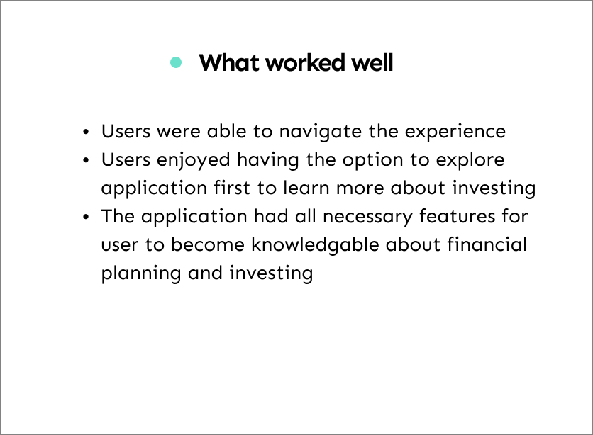
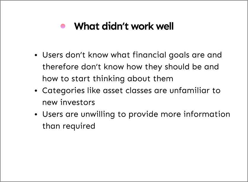
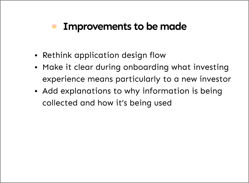
I tested the application at various stages of the project


I took the feedback that was given to me and began modifying the application with suggested improvements. Once I had confidence in my design flow, I moved to hi-fidelity prototyping and began defining my brand and visual identity.
The choice of the application name "Zu" is named after my friend. The choice of a parachute for the app logo is not only homage to his love of extreme sport but a representation of the mission to help people build a path towards long-term financial security.
The objective of the interface was to deliver sound financial information whilst still keeping the app engaging. I achieved this by designing with heavily rounded corners, lighthearted interaction including iOS Emoji 14.0, and a vibrant colour to contrast against a neutral base colour palette
Zu makes it easy to learn about investing and begin investing by setting financial goals